


The dashboard illustrates important key ratios to the right people in real time
A dashboard can be built using different parts depending on which key ratios or results are most important to illustrate. The management group can have a dashboard that illustrates KPIs from the entire company, both internal and external, while department managers can have a dashboard that only illustrates their own departments. In this way, the people in the company that only need to view the most important key figures will not need to plough their way through statistics or be technically minded. All you need to do is send them a link to a dashboard that is continuously updated in real time.
See example of a real time dashboard
Net Promoter Score measures customer loyalty
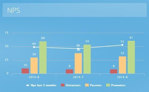 One example of an important KPI that can be continuously followed via a dashboard is the company’s Net Promoter Score, (NPS), which is measured by asking how likely a customer is to recommend the company to a friend or acquaintance. NPS is a measuring tool that is based on one single question, although most companies like to give their customers the option to make a comment or answer a few more questions.
Your NPS illustrates how loyal your customers are at that point in time, making it easier for you to detect dissatisfied customers. With a dashboard displaying your NPS and how it changes over time, you will be able to take immediate action on feedback.
Different time frames for NPS results
To gain even better insight into how loyal your customers are, different time frames can be added. One example is to show the last twenty answers and all answers from the past month. If there is an option for customers to add comments, they can be illustrated through a word cloud that shows the words that are most frequently used in the comments.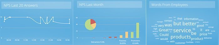
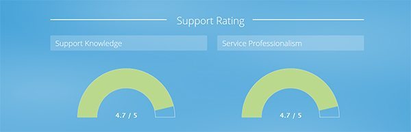
Real time feedback on customer service
Having knowledgeable and service-minded staff members in a customer service department is highly important, as they are the ones that have the most contact with your customers. A real time dashboard shows these two factors alongside one another, providing you with the opportunity to keep your eye on what’s happening. This dashboard can illustrate the results from a survey that has been sent directly to the customer after contact with your customer service department. The customer is asked to respond to a few short questions about their experience and the results are posted on the dashboard immediately. Since the service is evaluated continuously and the results are presented in real time, it is much easier to act quickly should the figures deteriorate.
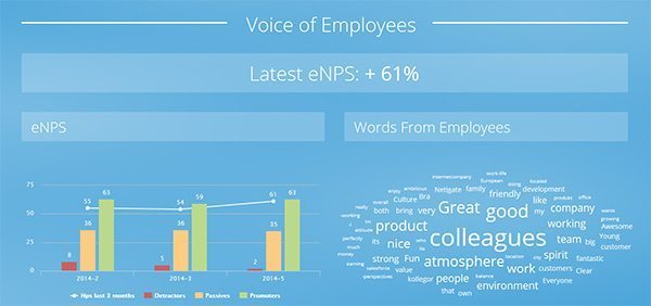
Continuous employee feedback
Since employees can change their attitude and level of commitment very quickly, an annual survey is not enough. By sending out additional short surveys during the year you can gain an understanding of how your employees feel and do something about it quickly. The profitability and growth of a company are usually directly related to the dedication of the employees – satisfied and loyal members of staff that are happy at work do a better job, and that is something that does not go unnoticed by the customers. Many companies use employee Net Promoter Score, eNPS, as a way of obtaining a clear figure that can be measured over time, often with a few additional questions. You could say that eNPS is the internal equivalent of Net Promoter Score and it provides a value that is easy to measure over time and compare between different departments. Results from eNPS surveys that are carried out continuously are good to follow in a dashboard since they provide fast indication of how employees feel at that particular moment in time.
How Jernia works with dashboards and automated feedback
The Norwegian company Jernia sends NPS surveys to its customers and presents the results in dashboards. This method allows Jernia’s management team to monitor overall performance and discover important trends among its customers. Every regional manager is able to compare its region with customer ratings from other regions. Read more about how Jernia distributes its survey results to the entire company by using Net Promoter Score and dashboards.
Download case
How do you distribute information at your company?
Is too much or too little information your biggest problem? Please tell us what you think in the comments box below.


