Ruotsalainen tietoyhtiö on tuomassa tarkoituksenmukaiset ja räätälöidyt ratkaisunsa suomalaisille asiakkaille. Tiimin tuorein jäsen tulee Helsingistä.…
“Finding great ideas is easy, great execution is not.” Ever tried, ever failed. The value…
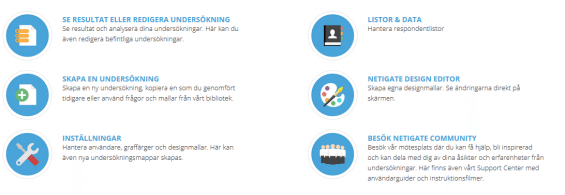
Dear Netigate user, In September 2015 we launched our new Insight platform and on the…
A basic overview of how to use Netigates insight platform to analyze the result of your surveys.
The global debate that raged on Friday 27thFebruary now has come to a final decision according to our study. 55% say the dress is white and gold and only 45% believe that the dress is blue and black.
Girlfriends, cousins, parents, pets and colleagues. Those are just a few examples of the people we want to woo on Valentine’s Day. Our All Hearts’ Day competition gained a lot of interest and we have now picked a winner.
What is API and how can it help you save time and work more efficiently with feedback from customers and employees? API means Application Programming Interface and makes it possible for one system, for example a CRM system or ERP system, to talk to another system, for example a survey system. This means that a specific event in another system can trigger a survey to be sent out automatically.
There are numerous ways to prepare and present survey results. If you want to visualise your data easily comprehensible and appealing, infographics provide excellent opportunities to communicate even the most complex or “dry” facts and figures. Well-designed infographics are also ideally suited to generate attention in today’s information overload and to be shared in different social networks.
Once you have gathered the results of your survey, it can be difficult to know what to do next. In fact, distributing your KPIs and other key ratios can be a bit of a dilemma – too much information, not enough information, too much to the wrong people or not enough to the right people. Which channels are the easiest to use? Who you need to inform about the results is often the easy bit, but it is harder to distribute the right information to the right people as time effectively as possible for everyone concerned. PowerPoint and Excel documents are all well and good, but to simplify matters, a real time dashboard, which you only need to send a link to, is definitely the easiest and most graphically appealing method. Read more about how different KPIs and key ratios can be visualised on dashboards and see examples of how they can look.
On a flight between Berlin and Stockholm, our CEO Tobias Thalbäck experienced not only bad service, but also how it feels when you as a customer are not being listened to. Read more about how the airline company handled the situation and Tobias’ thoughts about the importance of closing the feedback loop – not only to listen to your customers, but also to let them know that they have been heard.
Some time ago we released our new function Survey Design Editor where you, through drag and drop technology, create how the surveys you send will look like. Now you get an even easier option by three pre-designed templates that are ready to use for you when you create your survey. Of course, they are responsive and work in all browsers. We will continuously add more poll templates to make it even easier for you to quickly and easily select various appearances on the questionnaire. Please contact us if you have suggestions about the design template!
The goal of market and public research is to get a clear picture of for example what customers or other target groups think about a specific topic. The more knowledge you have, the better and more well-founded decisions you can make. With the right information it is also easier to aim communication efforts, improve products or services and to work with perceptions of your brand. Do you have a survey but no one to send it to? Learn more about how you can order answers from panelists, what to think about and in what areas market research can be effective.

 Copyright © 2025 Netigate AB, Drottninggatan 25, 111 51, Stockholm, Sverige
Copyright © 2024 Netigate AB,
Drottninggatan 25, 111 51, Stockholm, Sverige